The new icons for implants are shockingly ugly
Marathon has an incredible world design with excellent attention to detail, and I felt like the icons for implants in your stash and inventory used to be a great example of that. Not anymore!
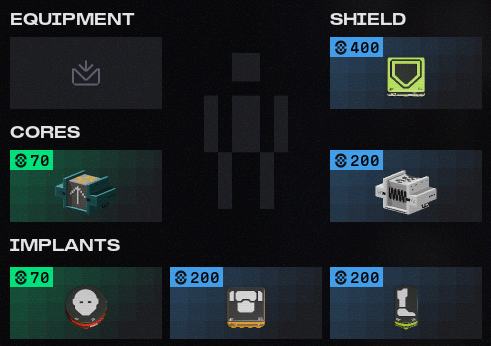
Even though it is really not, the iconography of many items in the game looks pixelated to the eye. The two cores shown in the picture display this. The arrow on the left and jagged waveform on the right seem to be made of discrete parts. Surrounded by icons like these, the implants stick out like a sore thumb. Their strange shapes - circles and squishy rectangles - filled with childishly drawn vector graphics completely miss the gritty aesthetic that the rest of the stash exemplifies. The foot of the leg implants appears more like a kid's impression of a car, and the torso implant is more like a Roblox character wearing a VR headset which its makers at Meta decided should have flaps sticking out on the left and right.
I really think the old icons were much better. Rather than having terrible illustrations of body parts embedded in strange canvases to show you what they did, they clearly highlighted their area of effect on a simplified figure, with a large and legible number in the corner, and a unique accent colour across the whole design.
Please revert.
Note: I mostly like the changes to the other icons. I think it's good that weapon mods look more distinct, although some of the larger chip mods are pushing the limits of their frames a little. My concern is only with the implants.
Thanks for making such an awesome game!
Commentaires
Hi there,
Thanks for sharing your thoughts and ideas for Marathon!
While we appreciate your feedback, the best place to share it is on the Marathon Discord where our developers can see it, rather than our Help Forums. If you haven't already done so, please share your feedback and suggestions in the server's dedicated feedback channels.
Thanks a lot!
Cette publication n’accepte pas de commentaire.